 At ParkMobile, we’re constantly listening to our users. We closely monitor app store reviews, social media channels, and our customer service team talks to users every day. We also do a lot of hands-on reach with our users. Our goal is to make sure that we are truly living up to our core value: “A Healthy Obsession with Customer Experience”. Recently, we made a few updates to the ParkMobile parking app based on your input, and we are confident that you’re going to like what you see. If you don’t already have the latest update, you can download our parking app here and see how it works.
We don’t want our users to feel like they “have to use” the ParkMobile app. We want them to have the best experience possible when they are using the app so they will tell others about it. Your feedback matters! So thank you for sharing your opinions. It really helps us make the app better.
Below are some of the latest ParkMobile updates to the app.
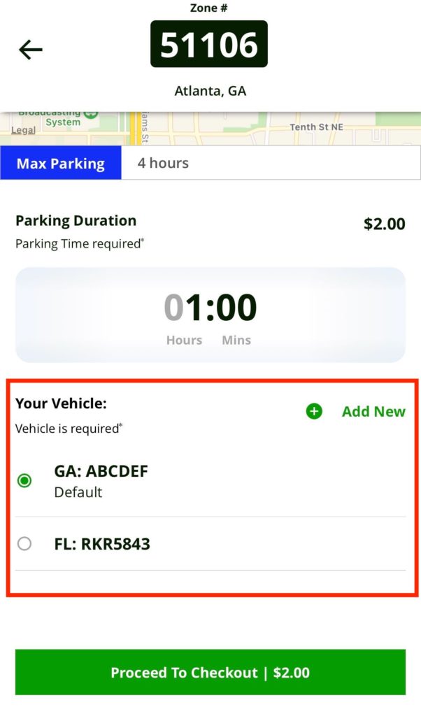
Update #1: Enhanced Vehicle Selection
When you’re ready to pay for parking in the app, it’s important that you make sure you are paying for the correct car. For instance, you own two cars and drive one of them more often than the other but one day you drive your other car. If you don’t remember to switch the license plates when you pay in the app, you risk getting a ticket. How can you make sure you don’t pay for the wrong car? Answer: easy vehicle selection. Our new design makes sure that you see what car you are parking and gives you the ability to easily switch cars if necessary before you start your parking session. Bing, bang, boom, all good.
Update #2: A New Way to Find Your Zone Number
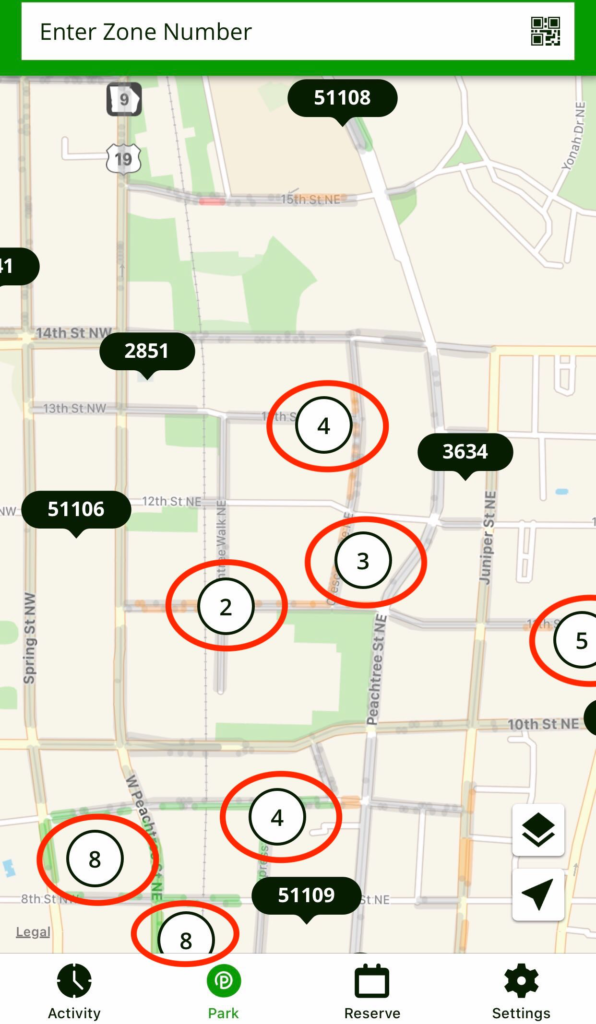
In the past, when you go into the app you would see a lot of “pins” that show all the zones in your area. The challenge is that in some locations, you might have multiple zone numbers on the same block. We’ve simplified it for you. Instead of just seeing “pins”, we’re going to show you the actual zone number for your location, making it easy to quickly tap the zone and start your parking session.
For areas where you have multiple zones, we’ve grouped them together. So, you just tap on the “grouping” and it will show you all the zone numbers in that specific location. Always remember to compare the zone number in your app with the zone number listed on the ParkMobile signs to make sure you select the right one.
We’ve made things all neat as a pin so when you look at your screen, you’ll see organized info that gets you where you need to go:
- Big picture: when your view is zoomed out all the way, parking pins in the same area are grouped together. The circled number indicates the number of pins in that area. To see the next level of detail, zoom in or tap on a pin.
- Details: now that you’ve zoomed in or tapped on a pin grouping, you’ll be able to see each pin’s zone number. Compare the zone in your app with the zone number listed on the ParkMobile street signs to make sure you’ll select the right one.
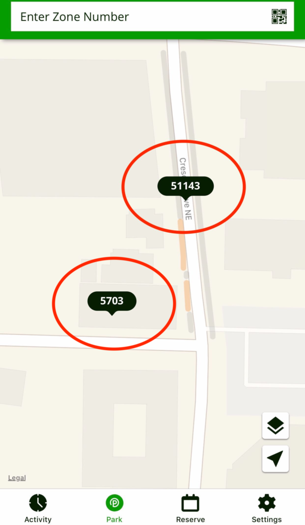
- Start your sesh: to start your parking session, just tap on the correct zone pin or manually enter the zone number.
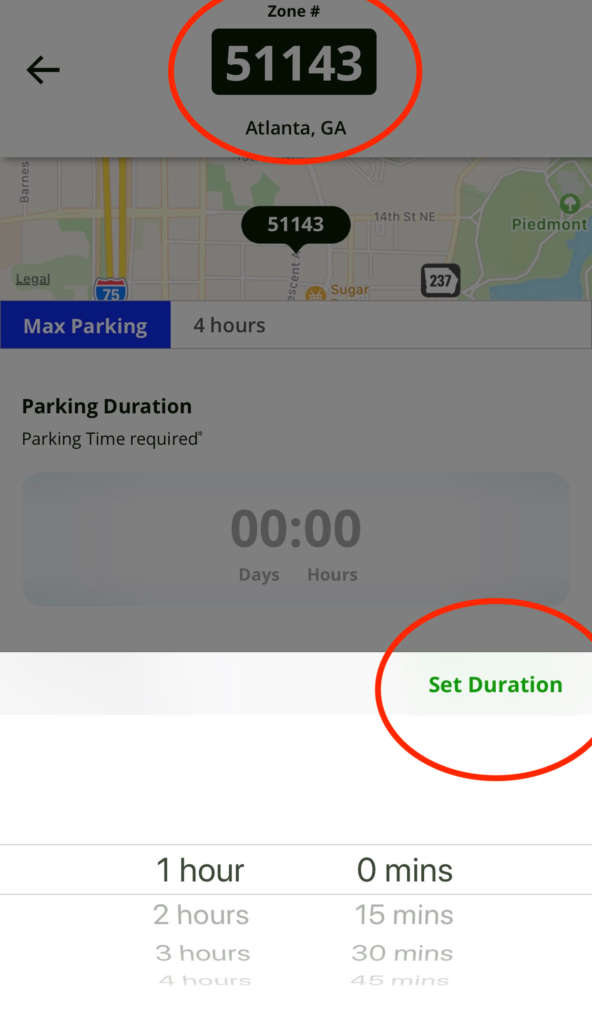
Update #3: Color Change
We made some minor color changes in the app. Although it might seem like a small adjustment, colors can really impact an app’s user experience and accessibility. The best colors can make key features easier to see and can alert a user to take a specific action. We want your parking app experience to be the best possible, right down to the last detail. We’re excited to introduce some new colors to our palate. #colormeimpressed
We hope you like these ParkMobile updates. Got feedback for the team? Submit it here.

 Get it on Google Play