One of the awesome parts of being a product manager is getting to run prospective client demos of our client portal, ParkMobile 360. It is an opportunity for me both to showcase the unique policy management and reporting features that we have built for our clients, as well as a chance for me to hear first impressions, questions, and feedback directly from those who are most critical to the success and growth of our business – our clients.
In early 2020 I was asked to do a demo of ParkMobile 360 focused on accessibility for the first time. Accessibility means creating a product that equally accommodates all users in its design. In other words, all users have an equivalent user experience, regardless of disabilities or other considerations. Although it’s something our design team is well educated on, it had not yet been an area of focus for our client software. Our UX/UI team consistently tests to improve our app experience for broader usability, ensuring that designs are efficient, effective, and easy to use. However, we had assumed that our average ParkMobile 360 client would not need these accessibility features. However, the more I researched accessibility and its importance, I realized that:
- Many more people need products to be accessible than you might think, and
- These features can also make a website more usable even for someone who has no impairment
Following these realizations, we took action to identify how we could improve the ParkMobile 360 platform site the most for accessibility and usability. The three categories we focused on were:
- Color blind-friendly reporting
- Hover states
- Focus states and tab tracking
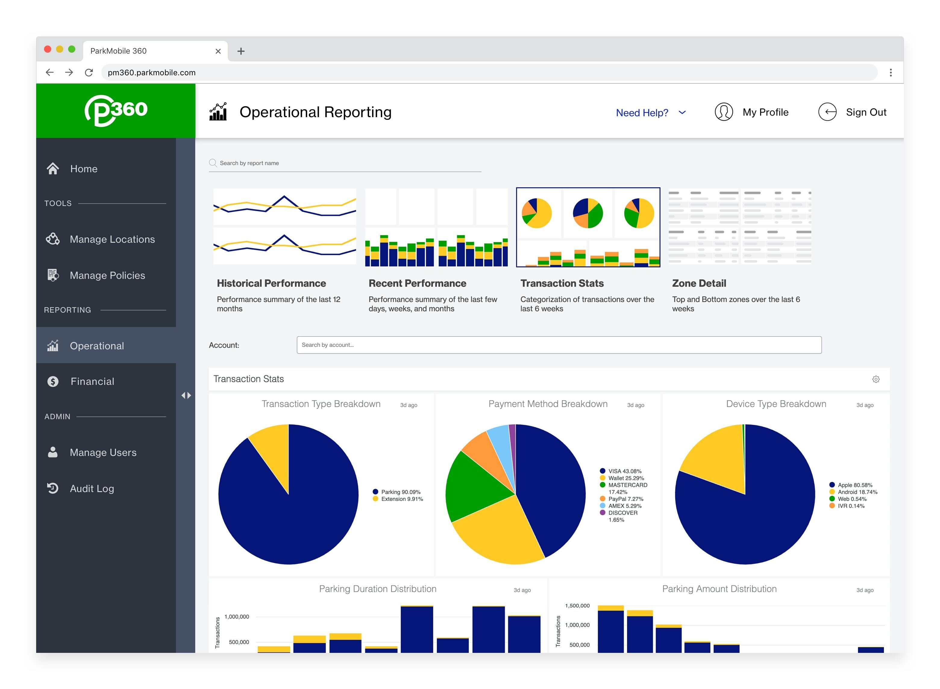
Color blind-friendly Reporting
This may surprise you, but approximately 8% of men are color blind. So, it was a very high priority for us to ensure that all visualizations in our reports were color blind-friendly because the majority of our ParkMobile 360 users are men. Our product design team created a beautiful, “easy to digest” color palette in which all colors are distinguishable from each other given any common type of color blindness. This visual allows all of our users to better focus on the information and insights in ParkMobile 360’s reporting.
Hover States
Hover states help users learn which elements on a webpage are clickable or interactive. For example, some text on the side of a webpage may change color or show as underlined when you hover your mouse cursor over it. If you click that text, the site takes you to a different webpage that relates to the name of that text.
We have added hover states to ParkMobile 360 to help users understand and navigate the robust features across the product including policy management, operational reporting, and user management.
Focus States and Tab Tracking
Focus states and tab tracking are like hover states; however, instead of relying on a mouse, the user can navigate and interact with the ParkMobile 360 platform using only their keyboard or other hardware. This ensures that the site is accessible for someone who has physical disabilities and cannot use a mouse. Now, users can go to any part of ParkMobile 360 and complete tasks such as viewing and managing locations, users, and reports, simply by using their keyboard’s tab, enter, and escape keys.
ParkMobile Brand Cohesion
In addition to these important accessibility improvements, we have also made two other key changes to align ParkMobile 360 with our company brand and consumer-facing products. First, the font across ParkMobile 360 is now our company’s font, proudly displayed across ParkMobile.io (where you’re reading this now!) and our Reservations Web App.
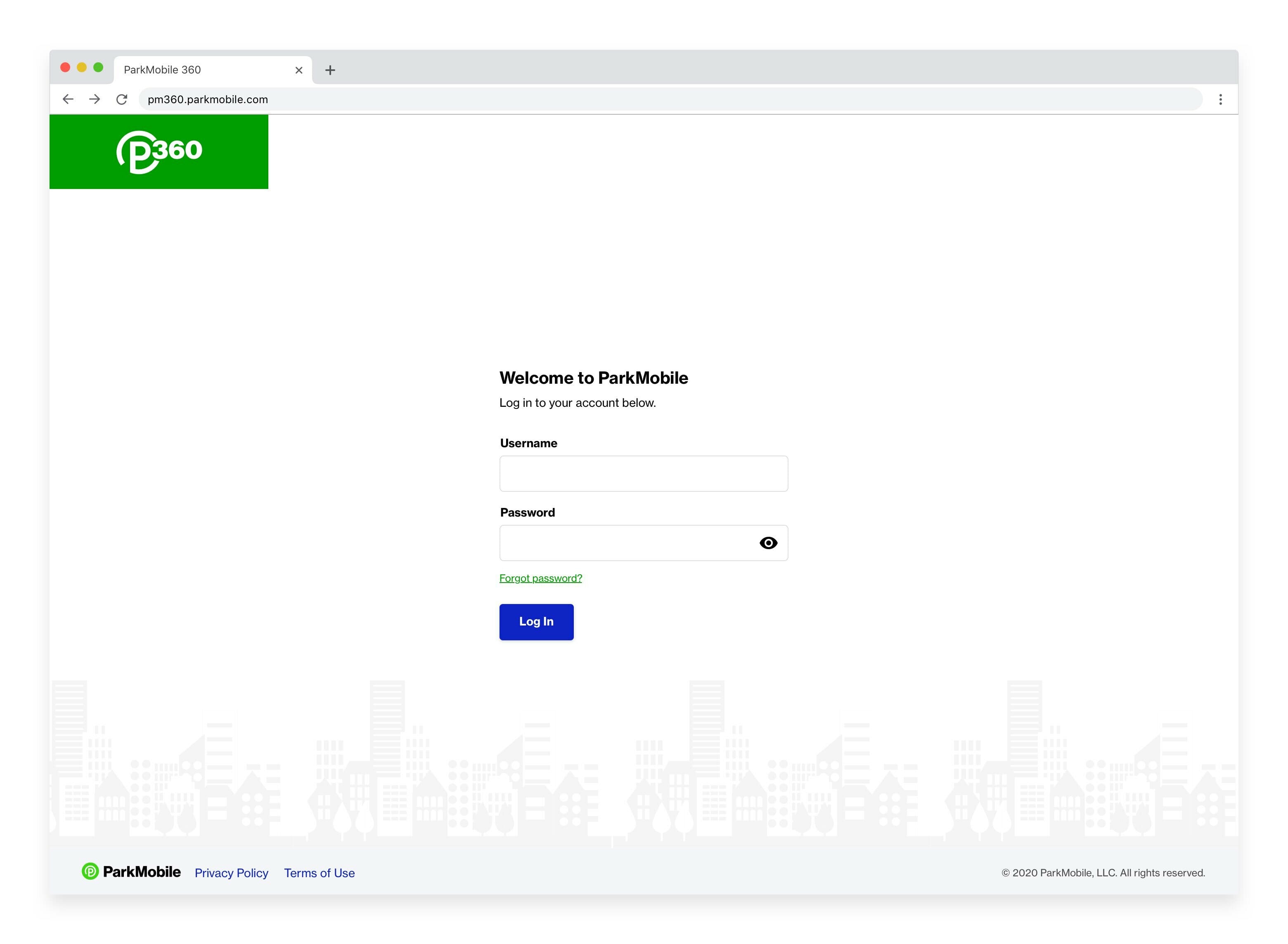
This is possible because ParkMobile 360 now uses Core UI, a component library that we built to bring ParkMobile’s brand consistently to all our web products and to provide a better experience for our users. You’ll notice a change in colors and interactive elements like forms and buttons. ParkMobile 360’s login page is a great example of this addition. Over time as we work on other aspects of the website, the components between the consumer website experience and ParkMobile 360 will overlap more and more as we grow our Core UI program.
In our next blog post, we’ll give an update on our exciting new multi-vendor reporting feature that we just announced. You can read more about it here.
 Get it on Google Play