In recent years, ParkMobile’s web efforts have grown from a simple marketing site to an entire product suite, including dozens of white-label applications. This growth has been exciting, but it’s also caused a few development headaches.
With so many different products to maintain, ParkMobile’s guidelines for branding, accessibility, and web development slowly became scattered across various Scrum teams, Confluence spaces, and Git repositories. As our product suite grew, ParkMobile’s designers and engineers had to work harder to maintain the consistent, accessible, and attractive user experiences our customers deserve.
To solve these issues, ParkMobile decided to assemble a dedicated design and engineering team to build the foundation of our future web products. After months of hard work, we’re excited to share the result–ParkMobile’s own React component library, Core UI!
Another Component Library?
These days, open-source component libraries are everywhere. From battle-tested libraries, like Material UI, to newer options, like Uber’s Base Web, there should be a solution for everyone. So why did we create our own library?
While it’s true that the open-source community has created a variety of excellent component libraries, it’s also true that the devil is in the details. After a thorough review of the open-source landscape, we found that it would be difficult to adopt an open-source solution without accepting some heavy tradeoffs.
For example, Material UI and Base Web are both excellent libraries with comprehensive documentation, but both libraries depend on specific CSS-in-JS solutions (React JSS and Styletron, respectively). Material UI has made promising strides toward offering a styling-agnostic solution, but its team still has a lot of work to do. Given that our product teams had already invested heavily in Styled Components, these dependencies made Material UI and Base Web difficult to adopt.
But what about the dozens of other libraries out there? Although our team didn’t encounter deal-breaking tradeoffs with every library that was investigated, we did struggle to find a library that struck a good balance between widespread adoption and flexibility. More importantly, we ultimately realized that these concerns were beside the real point–developing a component library could lead to a number of substantial benefits for our company.
Accessibility
ParkMobile has always prioritized performance, ease-of-use, and accessibility in our products, but our web applications still needed some accessibility upgrades. We knew our users deserved better, and we wanted to get serious about accessibility, but our teams weren’t sure where to start. By building Core UI in-house, our engineers could prioritize accessibility features and research over other development while centralizing our knowledge and understanding of best practices. The results have been better than we’d hoped! Every Core UI component API is designed to encourage accessibility best practices, and our documentation and tools offer simple guidelines for all of ParkMobile’s web developers.
Branding
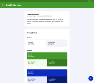
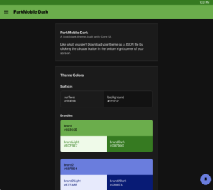
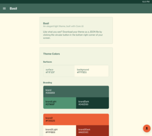
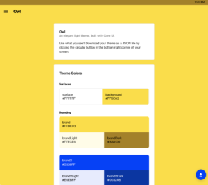
Branding is important to any company, and ParkMobile is certainly no exception. Although most open-source component libraries offer some form of customization, an in-house library offers a truly blank slate. With Core UI, our development team was able to work directly with our designers to build a design system and components that are uniquely ParkMobile. From colors to spacing to animations, every aspect of Core UI has been designed to reflect ParkMobile’s brand. What’s more, our team was able to build a truly innovative theming system to support even greater flexibility than Material UI or Base Web. The new system enables us to design completely custom white-labels that fully capture our clients’ branding. Check out some of the diverse themes below!
Alignment
Cache invalidation and naming things may be two of the hardest problems in Computer Science, but they aren’t the only hard problems. Scaling knowledge of patterns and practices across an entire engineering organization is pretty tough, too. Like most companies, ParkMobile has struggled to keep teams aligned on engineering best practices and reusing existing work. With Core UI, ParkMobile’s engineering leadership saw a unique opportunity to create a center of excellence around JavaScript and React.
Initially, Core UI’s development was lead by a single team. Now, all web teams at ParkMobile use and contribute to the library by fixing bugs, improving documentation, and creating new components. Accordingly, Core UI has served as a touch-point for all React teams at ParkMobile. When one team solves a problem that might benefit others, the solution is contributed back to Core UI. By simply choosing to develop a component library in-house, ParkMobile has managed to codify best practices, facilitate communication between disparate development teams, and eliminate a ton of unnecessary work. Maybe the problem wasn’t as difficult as we thought.
Is It Done?
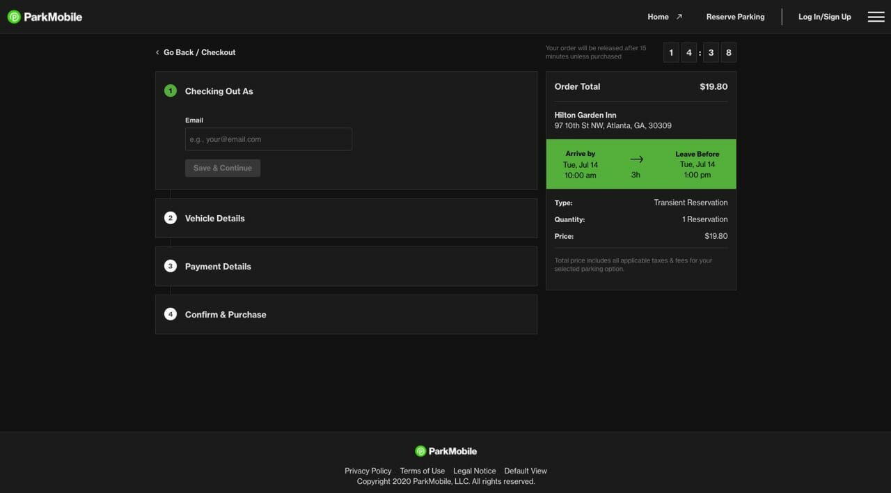
We’re excited to announce that Core UI is rolling out across all of our web products! Although the work is far from complete, some improvements are already available today. For instance, we recently updated our Reservations Web App to feature more accessible colors, font sizes, and a refreshed dark theme. We also added improvements to ParkMobile 360, like a more attractive and accessible login page. We’ve even started to update educational and administrative pages in our internal Developer Portal to better reflect the ParkMobile brand.

And these changes are just the start! Over the next few months, we will implement even more design and accessibility improvements across our web product suite. You’ll notice stronger, more cohesive branding, as well as improved support for assistive technologies like screen readers. We’re so excited to be improving our web products and making progress toward the accessible experiences that our users deserve. We can’t wait to hear what you think!
What’s Next?
With the launch of ParkMobile Labs, ParkMobile started the journey to becoming a company that consistently contributes back to the open-source community. Although we’re too early in that journey to release Core UI as an open-source library, we’re committed to sharing the knowledge, lessons, and best practices we’ve learned from its development. During the coming months, we’ll post insightful deep-dives into Core UI’s implementation details. We’ll cover a variety of topics, including theming, CI/CD, React patterns, and more. Stay tuned!
 Get it on Google Play