Taking Full Advantage of Your Best Marketing Tool
Whether you are rolling out a contactless parking payment solution for the first time or expanding an existing one, an effective marketing strategy is essential to drive adoption. While social media, email campaigns, and other digital marketing strategies undoubtedly play an important role in your marketing engine, the undisputed king in increasing adoption is arguably the simplest: effective signage.

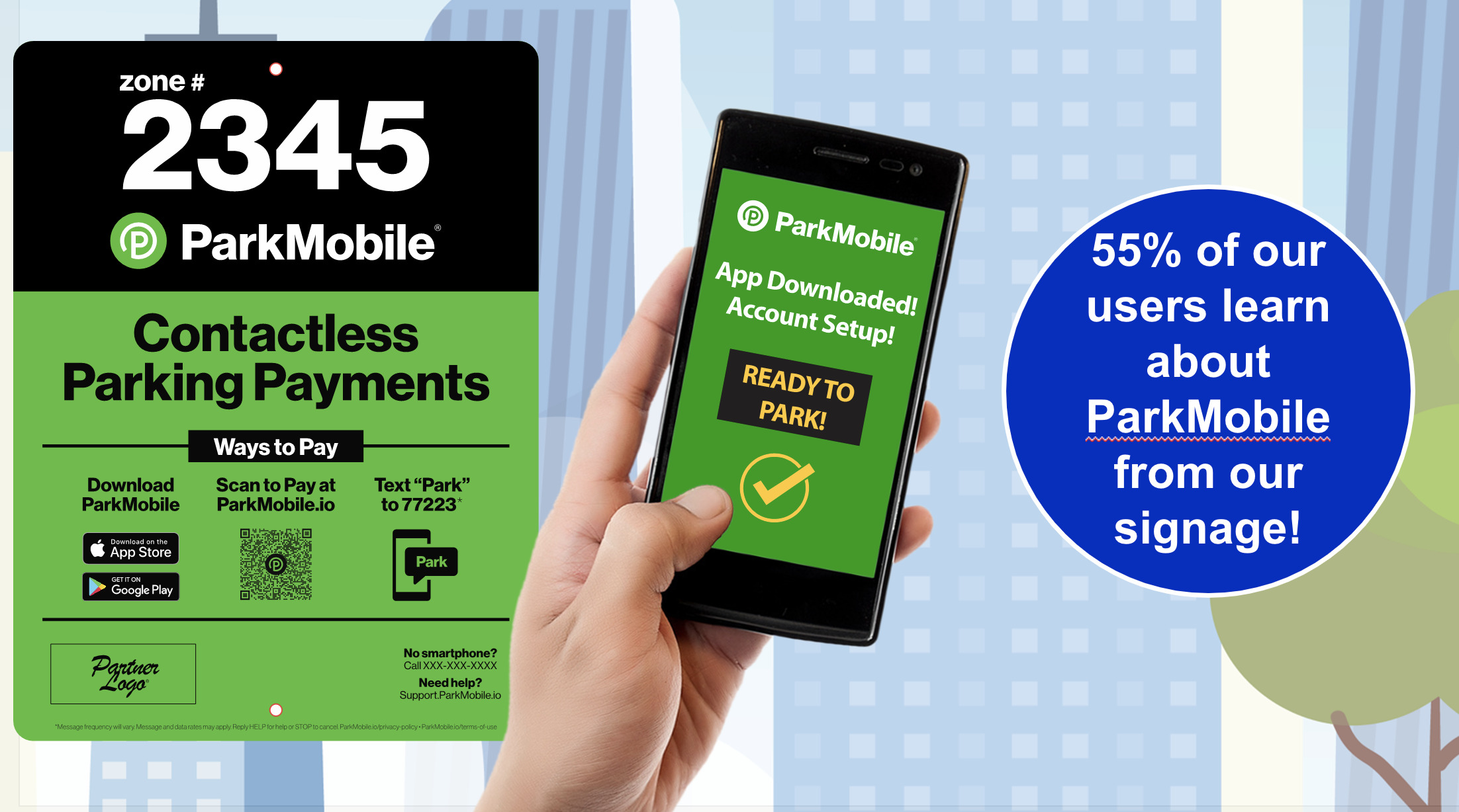
When surveyed, a whopping 55% of ParkMobile users said they first learned about the app through our signage. Not only is signage important at the time of launch, but our research shows that simply improving existing signage can increase new app users by up 17%. In other words, regardless of how tech-savvy users are, the value of keeping your permanent signs, stickers, A-frames, and other physical visual tools up to date can’t be understated.
As America’s leading parking payment solution, we’re continually refining our signage to be as high-impact and effective as possible. Based on thousands of successful ParkMobile rollouts, we’ve compiled an overview of signage tips and best practices.
The Elements of Effective Signage
Generally speaking, the overall goal of signage is both to educate new users and reduce any friction in the overall customer experience. However, as many parking providers know, there’s a world of difference between simply having signage and having signage that really works.
Breaking it down, there are two major elements that work together to create high-impact signage:
- Design: The way information (text, icons, colors, etc.) is laid out on the signage itself.
- Placement: Where a sign, sticker, A-frame, etc. is physically placed, and how many are needed.
 For many people, signage, not the app itself, is their first introduction to a contactless payment solution. If either of these two elements are unclear or not used optimally, signage has the potential to create more confusion. Ultimately, that friction can lead to slower adoption or even compliance issues down the line.
While ParkMobile collaborates closely with clients to create signage that is tailored to their needs, there are some general principles we always try to follow.
Signage Design: Less is More
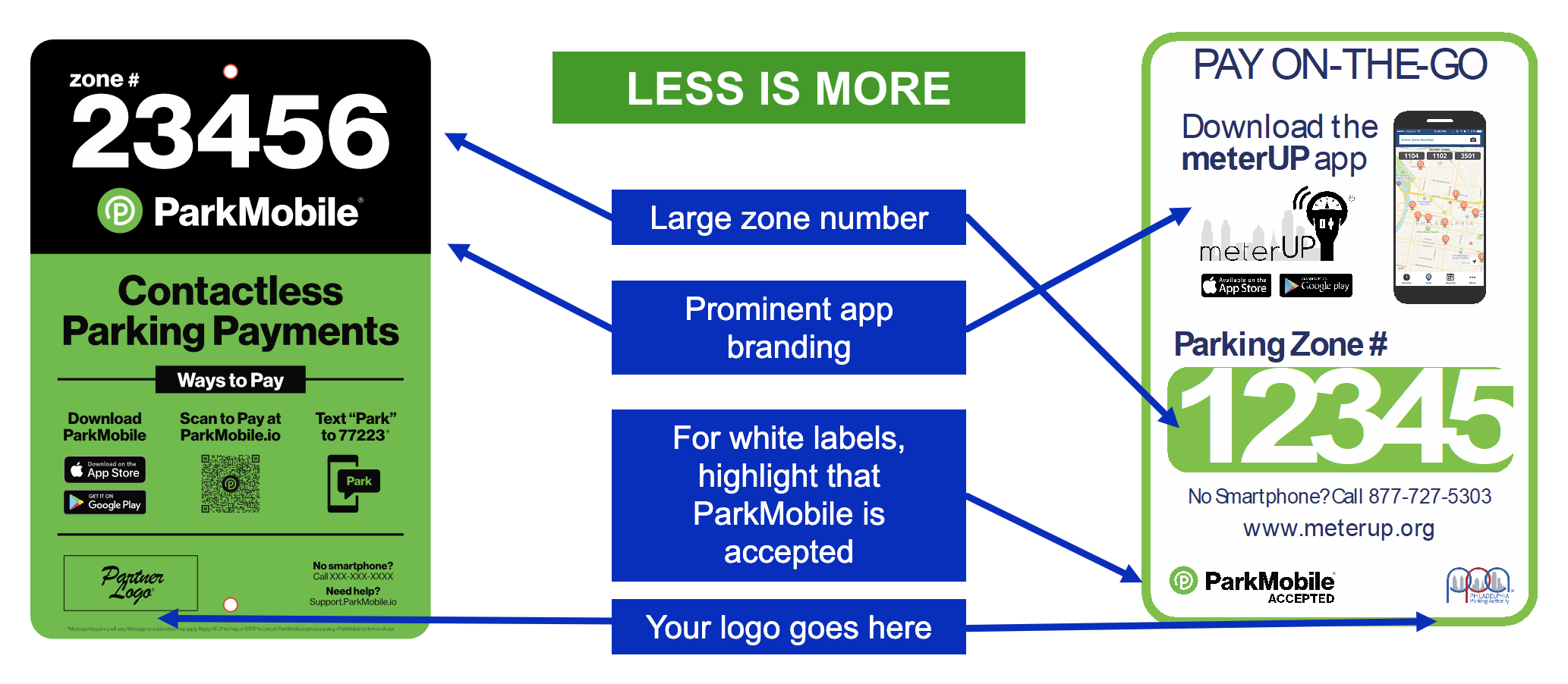
Signs and stickers should be designed to convey only the most important information as quickly as possible. One of the most common mistakes we see on ineffective signage is a design that is too cluttered or provides too much information. While the specific details on a sign may vary by client, a good sign usually prominently features:
- The Zone Number: Display the zone number in a large font and give it prominent placement near the payment app logo.
- The ParkMobile or Branded App Logo: This lets people know exactly what they need to get started and what to look for online or in an app store. If the logo isn’t prominent or not current, customers may struggle to know what they need to use to pay.
- Ways to Pay: A quick overview of the various available payment methods such as: by app, pay by web, Google Pay, or pay by text.
- Sticker Shape: In addition to the information included on the sticker, we’ve found customizing the shape of stickers to fit your existing hardware significantly increases their visibility.
 One thing not to include on signage for contactless parking is the rate. This gives you maximum flexibility to adjust rates or roll out dynamic pricing, without the need to replace any signs or stickers.
The “less is more” approach also applies to parking providers utilizing multiple payment vendors. To reduce clutter and confusion, ParkMobile recommends trying to keep all your vendor logos on a single sign. Keeping signage up to date is incredibly important to prevent user frustration or confusion. So, it’s worth noting that your signage will need to be updated every time you change or remove a vendor.
Signage Placement: Catch the Customer’s Eye to Maximize Your Impact
Equally important to the layout of the sign is where it’s physically placed and the number of signs you use. By displaying ParkMobile as a payment option as largely and clearly as possible, we hope to spread awareness and smooth out the adoption process. To make our signage blend seamlessly with a client’s existing hardware, ParkMobile also identifies ideal sticker sizes based on the make and model of your equipment.
To get the most out of ParkMobile signage, it’s best to adjust the placement of stickers and signs based on the specific parking scenario they’re being used for.
Single Space Meters
For both on and off-street meters, a sticker should be placed on the face of the meter that is facing the street. If possible, placing an extra sticker on the sidewalk-facing side is ideal to maximize visibility for on-street parking. Avoid placing stickers too low, for instance on the pole of a traditional coin-operated meter, to avoid people inadvertently missing them. To supplement the stickers, we also recommend installing larger signs at regular intervals in relation to the total number of spaces.
For on-street parking, place a sticker on each meter and install one 12×18 sign for roughly every five metered spaces. For off-street, place a sticker on every meter so they face the driver, and also install one 18×24 sign for every 10 – 15 spaces.
Multi-Space Meters and Paystations
Using multiple stickers is best when introducing ParkMobile to an area with multi-space meters and paystations. At a minimum, place one sticker on either side of the station and an additional one on the payment side, if possible. Since most people’s instinct is to head towards the meter, the goal is to make ParkMobile signable visible both while they’re approaching it and before they pay.
Like single meter parking, stickers should also be supplemented with signs, though the number varies somewhat for on and off-street parking. Installing one 18×24 sign per 10 – 15 spaces should be sufficient for off-street lots. For on-street, assuming each is placed in the middle of the block, install two 12×18 signs between the meter and each end of the block. If you have an existing u-channel signpost with a generalized “pay here” message, we recommend adding another rider-style ParkMobile sign underneath.
Contactless Payment or ParkMobile Only
Many cities, universities, and municipalities are increasingly trying to streamline operations and minimize maintenance costs by phasing out meters and pay stations entirely. In areas where ParkMobile or contactless payment is the only payment option, the placement of signs is especially crucial.
For every 10 spaces of on-street parking, it’s ideal to install three to four 12×18 signs. ParkMobile also makes meter topper signs so any existing meter poles can be reused.
Off-street ParkMobile Only parking spaces can’t rely on meters to automatically draw people’s eye, and generally require a greater number of larger signs to capture their attention. At a minimum, you should use one 18×24 sign for every 5-10 spaces, with additional 12×18 signs to supplement if possible. Additionally, have an A-frame or Windmaster installed at the entrance to make sure people are aware upfront that they need to pay, and how to do it.
Gated Parking
At a minimum, signage in gated parking setups should be installed near any paystations, elevator lobbies, stairwell entrances, or anywhere a driver is likely to go after they park. In other words, it’s vital to optimize signage placement for where foot traffic is highest. We also recommend installing large, visible signage at the entrance or the kiosk where customers pull a ticket to make sure they immediately know mobile payment is available.
Additionally, stickers should be posted on or near any pay-on-foot machine or in any nearby lobby areas where a person would typically pay for parking. For universities with metered or daily-decision parking options, signage displaying appropriate zone numbers can be placed prominently in the main entrance of buildings.
Final Thoughts: Staying Effective Means Staying Current
A key piece of ParkMobile’s ongoing marketing strategy is recognizing that reaching customers after launch is crucial to adoption and the long-term success of a contactless parking solution. Since it’s such an important part of creating a frictionless customer experience, this rings especially true for signage. Make sure to monitor the public response to signs and replace them as needed.
ParkMobile makes the process of creating and updating signage easy. As part of our marketing support, we provide accurate, cost-efficient signage options for every client. Leveraging our expert design team, we create high-impact signage that follows the latest industry best practices and is specifically tailored for your needs.
To learn more about signage best practices in-depth and see more examples, check out our signage deck.

 Get it on Google Play